Hi Walk Over October, hopefully you got my e-mail sent off on Friday. In the e-mail I has asked why there were only 50 cars, which you have now confirmed on this forum should be 58, based on average occupancy of a car is 1.3 people. Are you able to provide a link to where you obtained this statistic.
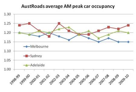
The one I found (and provided in the e-mail) was
Charting Transport - published Aug 2011
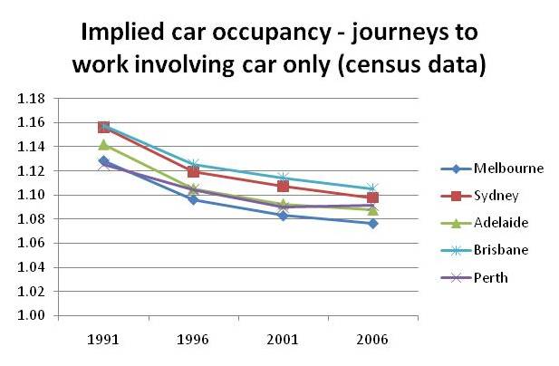
which shows an average occupancy of around 1.09 for Perth. This equates to around 70 cars required.
Should people care about the difference in number of cars? Given that our
Premier recently quoted 'We cannot continue to build roads for vehicles with one person in them, the way in which people travel and move around our city.', to me a difference of 1.09 and 1.3 is a lot, and additional 12 cars in the photo should be used.
In addition (and not discussed in the e-mail), it is really interesting to see the number of people on a Perth bus. The figure of 76 was only implemented in Dec 2011, when magically PTA increased the maximum number from 59, even though the buses weren't modified or road conditions modified either. So we are with a figure of 76 compared to Canberra's photo used 69, and the original Muenster photo used 72. However, the fundamental fault is, what is the average occupancy of a bus to passengers? I could not locate statistics, but would be very surprised it is 100% all of the time. So if we are going to use average occupancy of cars, why not buses. So for example, if a bus is 66% full, it would require 1.5 buses to transport that 72 people. Again why should people care about the difference in number of buses? If you have ridden on a road, with a bus overtaking you in the same lane, it is not a pleasant experience. The environmental impact is also greater when we are using buses designed to carry 76 people, and they don't (ie why aren't we running smaller buses in areas what don't have 80-100% occupancy?).
I like the idea of replicating the photo, but it should be based on actual usage, and on Perth/Fremantle usage.
As an additional idea, why couldn't an additional photo taken on actual modes of transport. For example,
City of Perth's Vision came out last week showing:
Private Car - 68.9%
Public Transport - 10.4%
Walk - 2.2%
Travel by bike is not even recorded in this high-level document, but I think it is around 2% (don't ask me what the other modes of transport are which are not listed above), but this also gives a picture of how WA's travel to work. Would this not also be a interesting picture if this could be demonstrated as a bar chart, using cars/people/buses/cyclists as the bars? You will need more cars though.